Analyzing Survey Data in R: A Crash Course (Part 1)
A step-by-step lesson
In this crash course, I will share 15 common tasks for survey data analysis in R. I plan to share these tasks in three parts.
This course is most suitable for beginners who want to quickly learn coding in R to begin survey data analysis for their research.
**You can find the video lectures of this crash course in the course website😊**
I am assuming you know some fundamentals of R. For example, you know the following operators:
<- (assignment)
= (assignment)
== (equal)
> (greater than)
< (less than)
>= (greater than or equal)
<= (less than or equal)
!= (not equal)
| (or)
& (and)
Before we get started
Throughout this course, I will use publicly available real-world datasets. Also, I am assuming you have RStudio installed on your computer. In case you don’t, please use the cloud version of RStudio.
This article discusses the following:
Task 1: Importing a .csv file directly from the web
Task 2: Creating a subset (Selecting specific rows)
Task 3: Selecting specific columns
Task 4: Creating a binary (a.k.a. dummy) variable
Task 5: Renaming the levels of a categorical variable
Task 6: Creating a new categorical variable
Task 7: Creating a summary statistics table
Task 8: Creating a barplot
Extra Task: Creating a grouped/stacked barplot
Task 1: Importing a .csv file directly from the web
In this article, I am going to use data from the National Financial Well-Being Survey, conducted by the Consumer Financial Protection Bureau.
To download any .csv file openly available on the internet, we can use the read.csv( ) function. We do two things here:
- Put the URL inside the read.csv ( ) function.
- Name the dataframe. For example, I named it data.
data <- read.csv("https://www.consumerfinance.gov/documents/5614/NFWBS_PUF_2016_data.csv")
Task 2: Creating a subset (Selecting specific rows)
Oftentimes, the target population of our research interest is a subgroup, rather than the whole population.
For example, let’s pretend, we are interested in households with less than $50,000 annual household income. In other words, we want to analyze data from only those respondents who lived in a household with less than $50,000 annual income.
To get this subset, first I need to look at the survey codebook and see how the income variable has been coded.

So, in this dataset, the income variable has been named PPINCIMP. Also, selecting levels 1, 2, 3, and 4 would provide us with the responses for the respondents living in households with less than $50,000 annual income.
To get this subset, we are going to use the filter( ) function from the dplyr package. Let’s install the package, load it, and run the code:
install.packages("dplyr") #Installs the package

library(dplyr) #Loads the package

income50k <- data %>% filter(PPINCIMP<=4) #Gets the <$50k income subset
Once you run the above code, you will see the following:

So, now, we have the main dataframe (data) and the subset that has only lower-income respondents (income50k).
You can find the income categories inside this new dataframe:
table(income50k$PPINCIMP)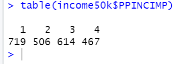
The income50k dataset only has respondents with less than $50,000 annual household income.
Task 3: Selecting specific columns
Sometimes, we may want to reduce the number of columns in our dataset. In other words, to explore our research questions, we may need only certain variables, and not others.
For example, let’s pretend that in the income50k dataset, the variables that we are interested in are: PPGENDER, PPHHSIZE, PPINCIMP, FWBscore, and finalwt.
To select the above columns/variables, we can do the following:
#Select specific columns in R
income50k <- income50k %>% select(PPGENDER,PPHHSIZE,PPINCIMP,FWBscore,finalwt)
Task 4: Creating a binary (a.k.a dummy) variable
Let’s pretend, we are not interested in all the education categories that our dataset provides. Rather we want to know something about people with less than a college degree and people with a college degree or above.
In other words, we are thinking about a binary education variable which would take a value of 1 if a respondent has a college degree or above and a 0 if their educational attainment is less than a college degree.
Let’s find the levels of the PPEDUC variable:
table(data$PPEDUC)
Let’s understand what these numbers refer to based on the information provided in the codebook:

Okay, here is the plan:
- Name the new variable COLLEGE.
- COLLEGE takes a value of 1 if PPEDUC >= 4; COLLEGE takes a value of 0 if PPEDUC < 4.
Let’s use the ifelse( ) function to create this new variable:
data$COLLEGE<- ifelse(data$PPEDUC>=4,1,0)Let’s see the levels of COLLEGE:
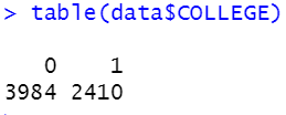
Awesome! 😊
Task 5: Renaming the levels of a categorical variable
Let’s check the PPINCIMP variable’s coding one more time:

Note that the levels of the PPINCIMP variable are 1, 2, ……, and 9, which aren’t very helpful. Therefore, we would like to rename the levels to make our analyses more comprehensible.
To rename the levels of this categorical variable, we can use the recode( ) function.
Here is the plan:
- Inside the recode ( ) function, first, we enter this: name of the data frame(data) $ name of the column (PPINCIMP). This is what we have on the left-hand side of the assignment operator (<-) as well. We are doing this because we want to rename the levels of the PPINCIMP variable which is located inside the data dataframe as a column.
- Next, we follow something like this: “Old name of a level” = “New name of the level”. And we do the same for each level.
data$PPINCIMP <-  recode(data$PPINCIMP,"1"="Less than $20,000",
                         "2"="$20,000 to $29,999",
                         "3"="$30,000 to $39,999",
                         "4"="$40,000 to $49,999",
                         "5"="$50,000 to $59,999",
                         "6"="$60,000 to $74,999",
                         "7"="$75,000 to $99,999",
                         "8"="$100,000 to $149,999",
                         "9"="$150,000 or more")

table(data$PPINCIMP)
It worked! 😊
Task 6: Creating a new categorical variable
Now let’s pretend, we are interested in people at the intersection of their gender identity and the generation that they belong to. Let’s have a quick look at these two variables individually.
table(data$PPINCIMP)
table(data$PPGENDER)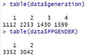
So, generation has four levels. Let’s check the codebook to learn what these numbers mean.

Again, let’s check the codebook to learn what the levels of PPGENDER mean.

Okay, so the generation variable has 4 levels and the PPGENDER variable has 2 levels. At the intersection of the two variables, there will be 4 x 2 = 8 levels.
However, the dataset doesn’t provide us with a separate variable with these 8 levels. Let’s create it ourselves!
This time I am going to use the ifelse ( ) function.
**Note that, the following code may seem a bit challenging. But nothing to worry about! You don’t have to memorize anything. Just copy and paste the following code, tweak the variable names depending on the dataset you are using, and you will be all good!**
data$GENERATION.GENDER <- ifelse(data$PPGENDER==1 & data$generation==1, 'Male, Pre-Boomer',
                                           ifelse(data$PPGENDER==1 & data$generation==2, 'Male, Boomer',
                                                  ifelse(data$PPGENDER==1 & data$generation==3, 'Male, Gen X',
                                                         ifelse(data$PPGENDER==1 & data$generation==4, 'Male, Millennial',
                                                                ifelse(data$PPGENDER==2 & data$generation==1, 'Female, Pre-Boomer',
                                                                       ifelse(data$PPGENDER==2 & data$generation==2, 'Female, Boomer',
                                                                              ifelse(data$PPGENDER==2 & data$generation==3, 'Female, Gen X',
                                                                                                                   'Female, Millennial')))))))
Here is a summary of my code shown above:
- I created a new variable named GENERATION.GENDER (that’s why I have data$GENERATION.GENDER at the beginning of the code).
- Because we have 8 categories at the intersection of the two variables (i.e., generation and PPGENDER), we write ifelse( ) conditions 7 times.
- The final category doesn’t need a condition because if the 7 conditions, referring to 7 categories, do not match for a respondent, they are going to be assigned to the final category (which is ‘Female, Millennial’).
Let’s check the levels of the GENERATION.GENDER variable:
table(data$GENERATION.GENDER)
Task 7: Creating a summary statistics table
Now, let’s do some real data analysis! 😁
Let’s pretend, we want to know how financial wellbeing — indicated by a variable(FWBScore) on a scale ranging from 0 and 100 — differs at the intersection of generation and gender.
Here is the plan:
- Use the group_by( ) function from the dplyr package. We want to group respondents based on the levels of the GENERATION.GENDER variable we created.
- We want these statistics for each level of GENERATION.GENDER: the number of respondents, mean FWBscore, median FWBscore, and standard deviation of FWBscore. We use these functions: n( ) → number of people; mean() → mean; median () → median; sd() → standard deviation.
- We use the summarise( ) function to get the above summary statistics.
- We use the round( ) function to round numbers to one place after the decimal.
- We put the table inside a dataframe called table.
Here is the code:
table <- data %>% group_by(GENERATION.GENDER) %>%
  summarise(Count=n(),
            Mean.FWBScore=round(mean(FWBscore),digits=1),
            Median.FWBScore=round(median(FWBscore),digits=1),
            SD.FWBScore=round(sd(FWBscore),digits=1)
  )
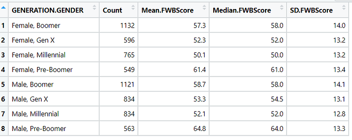
The above table is interesting, right?
Looks like, the oldest male respondents are financially the happiest, whereas the youngest female respondents are financially least happy. The intersection, appeatently, matters.
A better way to present the above table would be to show the same in a barplot.
Let’s create a barplot!
Task 8: Creating a barplot
We are going to use the table we created earlier to make a barplot.
Here is the plan:
- Use the ggplot( ) function from the ggplot2 package.
- Inside the ggplot ( ) function, first, put the name of the dataframe. The name of the dataframe here is table (as I named it earlier).
- Inside the aes( ) function, after “x = ”, put the value of the variable based on which your groups are categorized. In this case, the variable is GENERATION.GENDER, and therefore, I type x=GENERATION.GENDER. Similarly, after “y= ”, put the value of the outcome variable. In this case, the variable is Mean.FWBScore.
- Inside the geom_bar ( ) function, type stat= “identity”.
install.packages("ggplot2") #Installs the package

library(ggplot2)

library(dplyr) #Loads the package

ggplot(table, aes(x=GENERATION.GENDER, y=Mean.FWBScore)) +
  geom_bar(stat = "identity")
Okay, here is how my basic barplot looks:
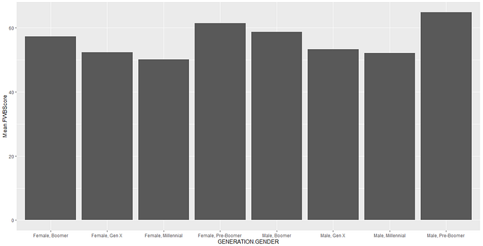
I want to improve it by doing the following:
- Flip the graph using the coord_flip( ) function.
- Change the theme to theme_light( ) function.
- Change the y-axis label.
- No need for the x-axis label as the categories are self-explanatory.
I do the above by running the following code:
ggplot(table, aes(x=GENERATION.GENDER, y=Mean.FWBScore)) +
  geom_bar(stat = "identity")+
  coord_flip()+
  theme_light()+
  labs(y="Average Financial Well-Being Score", x=" ")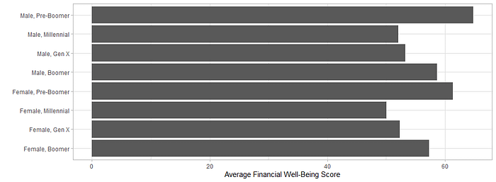
Looks fairly decent!
Extra Task: Creating a grouped/stacked barplot
Sometimes, we want to create a grouped or a stacked barplot.
For example, in the barplot we created above, we may want to incorporate household income (PPINCIMP) variable into the analysis. To do that, first, we need to incorporate PPINCIMP into the table:
table <- data %>% group_by(GENERATION.GENDER,PPINCIMP) %>%
  summarise(Count=n(),
            Mean.FWBScore=round(mean(FWBscore),digits=1),
            Median.FWBScore=round(median(FWBscore),digits=1),
            SD.FWBScore=round(sd(FWBscore),digits=1)
  )
Next, we do the following:
ggplot(table, aes(x=GENERATION.GENDER, y=Mean.FWBScore,fill=factor(PPINCIMP))) +
  geom_bar(stat="identity",position = "dodge")+
  coord_flip()+
  labs(x=" ",y="Average Financial Wellbeing Score",fill="Household Income")+
  theme_minimal()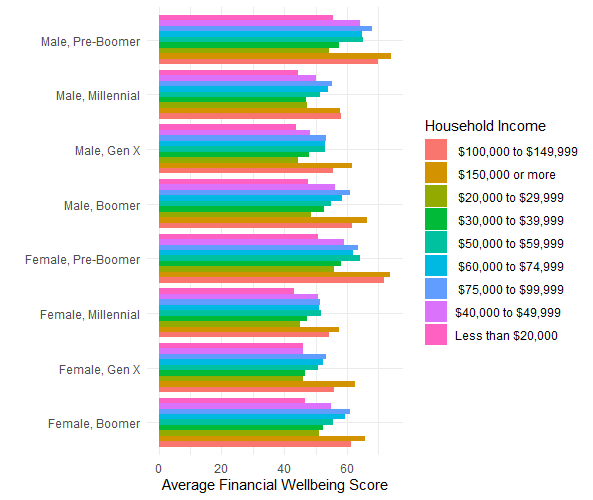
To convert the above grouped bar plot into a stacked bar plot, we make a small change into the code. We change the position = “dodge” to position = “stack”.
ggplot(table, aes(x=GENERATION.GENDER, y=Mean.FWBScore,fill=factor(PPINCIMP))) +
  geom_bar(stat="identity",position = "stack")+
  coord_flip()+
  labs(x=" ",y="Average Financial Wellbeing Score",fill="Household Income")+
  theme_minimal()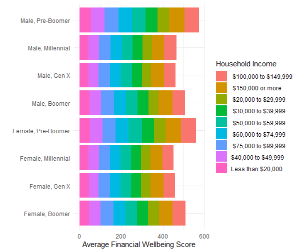
The stacked version of the barplot is harder to understand. And I would prefer presenting the grouped barplot in the context of our analysis.
Before we end, you may have noticed that the income categories aren’t ordered properly. This is because the levels of factors are, by default, organized alphanumerically.
Below, I present the code to recreate the group barplot with income categories shown from lowest to highest:
#Reording the levels of the PPINCIMP variable
table <- table %>% mutate(PPINCIMP = factor(PPINCIMP, levels = c("Less than $20,000",
                                                        "$20,000 to $29,999",
                                                        "$30,000 to $39,999",
                                                        "$40,000 to $49,999",
                                                        "$50,000 to $59,999",
                                                        "$60,000 to $74,999",
                                                        "$75,000 to $99,999",
                                                        "$100,000 to $149,999",
                                                        "$150,000 or more")))

#Creating a grouped barplot
ggplot(table, aes(x=GENERATION.GENDER, y=Mean.FWBScore,fill=PPINCIMP)) +
  geom_bar(stat="identity",position = "dodge")+
  coord_flip()+
  labs(x=" ",y="Average Financial Wellbeing Score",fill="Household Income")+
  theme_minimal()
Also, I want to change to more things. One, I want to use different colors than the ones that we got as default. Second, I want to reorder the categories inside the GENERATION.GENDER variable. Here is the code to do both and recreate the figure:
# Define custom colors from light gray to dark green
income_colors <- c("#E8F5E9", "#C8E6C9", "#A5D6A7", "#81C784", "#66BB6A",
                   "#4CAF50", "#388E3C", "#2E7D32", "#1B5E20")

# Define the order of generations, from youngest to oldest
generation_order <- c("Male, Millennial", "Female, Millennial", "Male, Gen X", "Female, Gen X",
                      "Male, Pre-Boomer", "Female, Pre-Boomer","Male, Boomer", "Female, Boomer")

# Reorganize the levels of GENERATION.GENDER to reflect the desired order
table$GENERATION.GENDER <- factor(table$GENERATION.GENDER, levels = generation_order)

# Create the plot
ggplot(table, aes(x = GENERATION.GENDER, y = Mean.FWBScore, fill = PPINCIMP)) +
  geom_bar(stat = "identity", position = "dodge") +
  coord_flip() +
  labs(x = " ", y = "Average Financial Wellbeing Score", fill = "Household Income") +
  theme_minimal() +
  scale_fill_manual(values = income_colors)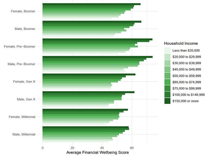
A “smarter” way (i.e., utilizing the pipe operator from the dplyr package strategically) to write the above can be the following:
# Reorganize the levels of PPINCIMP and GENERATION.GENDER, and plot the graph in one step
table %>%
  mutate(
    PPINCIMP = factor(PPINCIMP, levels = c("Less than $20,000", "$20,000 to $29,999", "$30,000 to $39,999",
                                           "$40,000 to $49,999", "$50,000 to $59,999", "$60,000 to $74,999",
                                           "$75,000 to $99,999", "$100,000 to $149,999", "$150,000 or more")),
    GENERATION.GENDER = factor(GENERATION.GENDER, levels = c("Male, Millennial", "Female, Millennial",
                                                             "Male, Gen X", "Female, Gen X",
                                                             "Male, Pre-Boomer", "Female, Pre-Boomer",
                                                             "Male, Boomer", "Female, Boomer"))
  ) %>%
  ggplot(aes(x = GENERATION.GENDER, y = Mean.FWBScore, fill = PPINCIMP)) +
  geom_bar(stat = "identity", position = "dodge") +
  coord_flip() +
  labs(x = " ", y = "Average Financial Wellbeing Score", fill = "Household Income") +
  theme_minimal() +
  scale_fill_manual(values = c("#E8F5E9", "#C8E6C9", "#A5D6A7", "#81C784", "#66BB6A",
                               "#4CAF50", "#388E3C", "#2E7D32", "#1B5E20"))
Below, I present the links to parts 2 and 3 of this crash course:
** Except otherwise noted, all the pictures used in this article are screenshots from RStudio based on the author’s code**
** If you found this article helpful, please consider following me! Also, please consider becoming an Email Subscriber so that you receive an email next time I post something!**
