Create Heatmaps in R Using ggplot2
A Step-by-Step Tutorial
A heatmap is a graphical method of showing numerical data using different colors and color intensities.
In this article, I explain how to create a heatmap using the ggplot2 package in R.
Dataset and Data Visualization Plan
I use a subset of a dataset (downloaded from gapminder) with data on the per capita CO2 emissions in 192 countries throughout 1800–2010 (with many empty cells, though).
For simplicity, we are interested in visualizing the changes in per capita CO2 emissions from 1950–2010 by the twenty-five most populous countries.
Also, rather than looking at every year, we will consider per capita CO2 emissions in each country during specific years (1950, 1955, 1960,……, 2010).
Let’s start coding! 🙂
Step 1: Load the packages and the dataset in RStudio
library(dplyr)
library(ggplot2)
library(reshape)#the dataset (.csv file) should be in the same folder where your R code (.R file) is. Also, in the beginning, click: Session -> Set Working Directory -> To Source File Locationg<-read.csv(“heatmap_co2.csv”)
Step 2: Select rows and columns using select and filter functions from the dplyr package
#Select certain columns (specific years)
g1<- g%>%select(country,X1950,X1955,X1960,X1965,X1970,X1975,X1980, X1985, X1990,X1995,X2000,X2005,X2010)#Select certain rows (specific countries)
g2<- g1%>%filter(country==”China”|country==”India”|country==”United States”|country==”Indonesia”|country==”Pakistan”|country==”Brazil”|
country==”Nigeria”|country==”Bangladesh”|country==”Russia”|country==”Mexico”|country==”Japan”|country==”Ethiopia”|country==”Philippines”|country==”Egypt”|country==”Vietnam”|country==”Congo, Dem. Rep.”| country==”Turkey”|country==”Iran”|country==”Germany”|country==”Thailand”|country==”United Kingdom”|country==”France”|country==”Italy”| country==”Tanzania”| country==”South Africa”)
Let’s have a quick look at the g2 dataframe.

We want to remove the Xs from the beginning of the column names.
Step 3: Remove Xs from the column names (X1950, X1955,…..,X2010)
#Remove “X” from the beginning of column names
for ( col in 1:ncol(g2)){
 colnames(g2)[col] <- sub(“X”, “”, colnames(g2)[col])
}
Okay, now g2 becomes this:

Cool! 🙂
Although the data presented above in the matrix format is useful, keeping track of all the numbers and identifying patterns is difficult.
This is where a heatmap comes into play and makes visualization much easier!
Step 4: Change the dataframe format using the melt function from the reshape package. This step is crucial!
g3<-melt(g2)
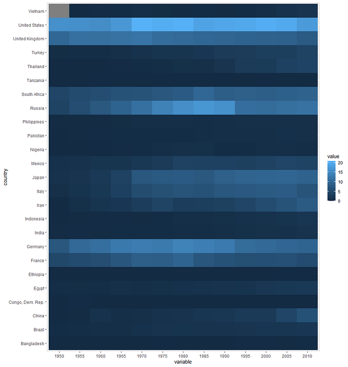
Step 4: Create the initial heatmap using the ggplot2 package
#Initial Heatmap
plot1<-ggplot(g3, aes(variable, country, fill= value)) +
 geom_tile()plot1

Note: Data for Vietnam’s 1950 per capita CO2 emission is missing. So, we observe a gray rectangle on the top left of the graph.
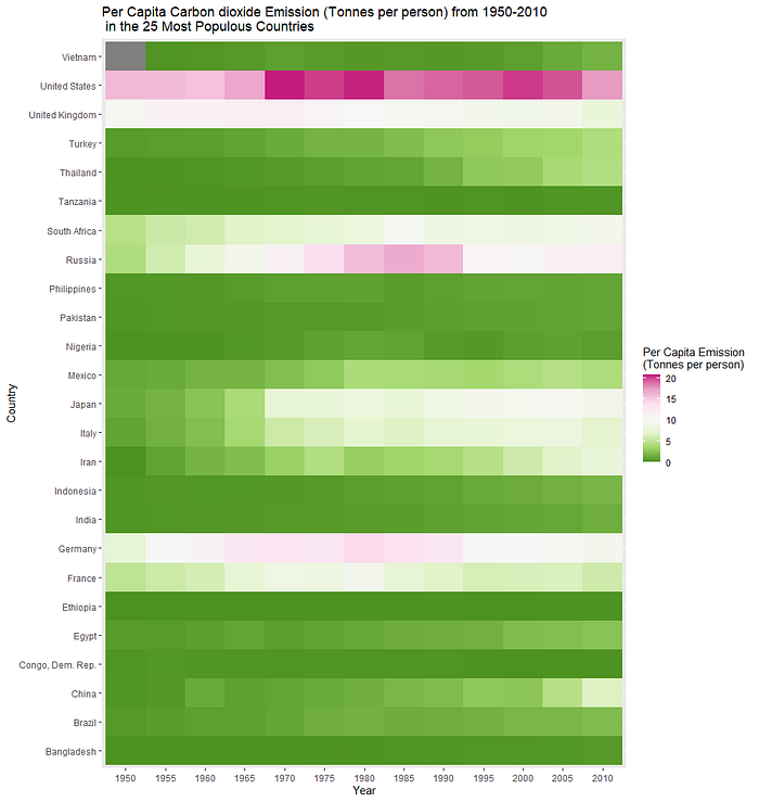
Step 5: Add axis labels, legends, and title
plot2<- plot1+xlab(“Year”)+
 ylab(“Country”)+
 ggtitle(“Per Capita Carbon dioxide Emission (Tonnes per person) from 1950–2010 \n in the 25 Most Populous Countries”)+
 labs(fill = “Per Capita Emission \n(Tonnes per person)”)plot2

Step 6: Try different palettes for your heatmap
#Let’s try some different palettes
plot2+ scale_fill_distiller(palette = 'Accent')
plot2+ scale_fill_distiller(palette = 'PiYG')
plot2+ scale_fill_distiller(palette = 'Spectral')
Some more palettes are available in the ggplot2 package. The complete list of all the palettes available in the ggplot2 package is presented below.
Diverging: BrBG, PiYG, PRGn, PuOr, RdBu, RdGy, RdYlBu, RdYlGn, Spectral
Qualitative: Accent, Dark2, Paired, Pastel1, Pastel2, Set1, Set2, Set3
Sequential: Blues, BuGn, BuPu, GnBu, Greens, Greys, Oranges, OrRd, PuBu, PuBuGn, PuRd, Purples, RdPu, Reds, YlGn, YlGnBu, YlOrBr, YlOrRd
Just place any of these into your code. For example, if you want to check the YlOrRd palette, type:
plot2+ scale_fill_distiller(palette = 'YlOrRd')Finally, if you want to manually select colors for your heatmap, type:
#Heatmap with manual colors
plot2+scale_fill_gradient(low=”pink”,high=”black”)
Thank you so much for following along!
If you would like to see how to create a line chart using the ggplot2 package in R, check my other article:
The original dataset was downloaded from: https://www.gapminder.org/data/
